A branding studio for ideas that shape change.

View Article
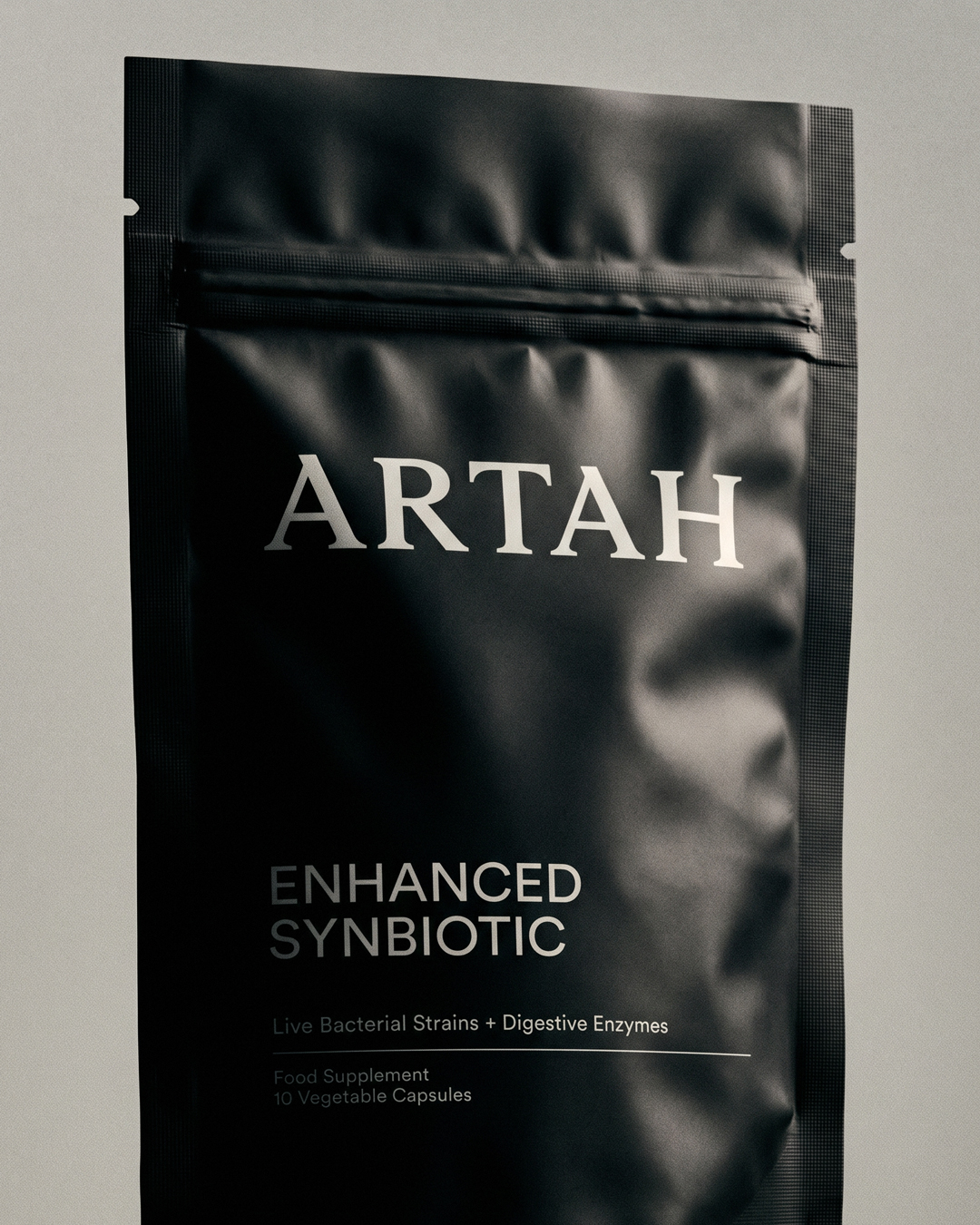
Two Times Elliott — ARTAH — rebrand hero shot of the matte black Enhanced Synbiotic stand-up pouch

Artah

Codifying science led nutrition to scale

    Brand Identity
    Verbal Identity
    Packaging

Artah came to us at a very familiar turning point.

Rhian Stephenson, a nutritionist and naturopath, founded the brand in 2021, grew it from a few specialist products into a full range, raised close to £3m, and moved from founder-led DTC into national retail. The product was as good as anything in the category, the science significantly better than most. The brand around it had fallen flat and without clear direction - and it needed to get noticed faster and feel far more alive across its retail and D2C packaging, website and social.

It’s an extremely hard category to stand out in. Most brands sound near identical. Everyone says they’re backed by science and everyone says theirs is the one that works. Underneath it, people want to feel better and take their health into their own hands, and half-believe it has to be a chore, that you have to go to extremes before anything changes. Artah is different where it counts. It’s practitioner-led, dosed to work, third-party tested, confident enough to run its own clinical and consumer trials, first into metabolic health, a certified B Corp. In a category most people half-distrust, that’s credibility the others can’t buy.

Our job was a brand big enough to carry that difference: one people instantly recognise, one that earns its price and works as hard on a Boots shelf as on the site, with room to grow into the immersive health space Artah wants next.

What came out is built around one central belief, which was already Artah’s own: feels good, to feel good. It takes optimal health, once clinical and effortful, and turns it into something that sounds like a good time, quicker to recognise, harder to mistake for anyone else, speaking the way its community does. When a brand is built on feeling good, it should look and sound like it too.

It leaves Artah easier to spot and easier to charge what it’s worth: the best in the UK, built to travel to Europe and the UAE. A brand that feels as good as it makes people feel.
View Article
Repositioning the fast scaling beauty brand‎  — Hello Klean

Hello Klean

Repositioning the fast scaling beauty brand‎

    Brand Strategy
    Visual Identity
    Verbal Identity

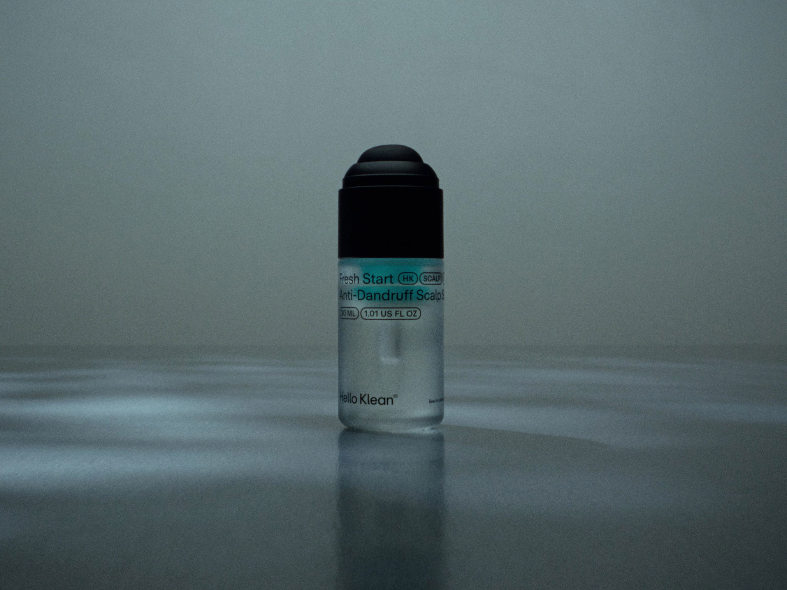
We partnered with Hello Klean to evolve them from a showercare essential to a company changing the world of beauty at the source.

By addressing the one element that no one new was impacting their hair and skin - their water, Hello Klean’s products have been transforming lives. A key challenge was to bring the power of the emotion experienced by customers to the surface within the brand.

Through our conversations with customers, and hearing how much impact bad hair and skin had on their sense of self, our central brand idea - Feel Like You - was a reflection of the impact the products had in helping customers regain control and reconnect to that sense of self.

With an ever-expanding product portfolio and a still low awareness problem, we had to create a space within the consumer's mind to frame both. ‘Beauty solutions for your water’ defines the brand as a holistic ecosystem of products focussed on making water work for your hair and skin.

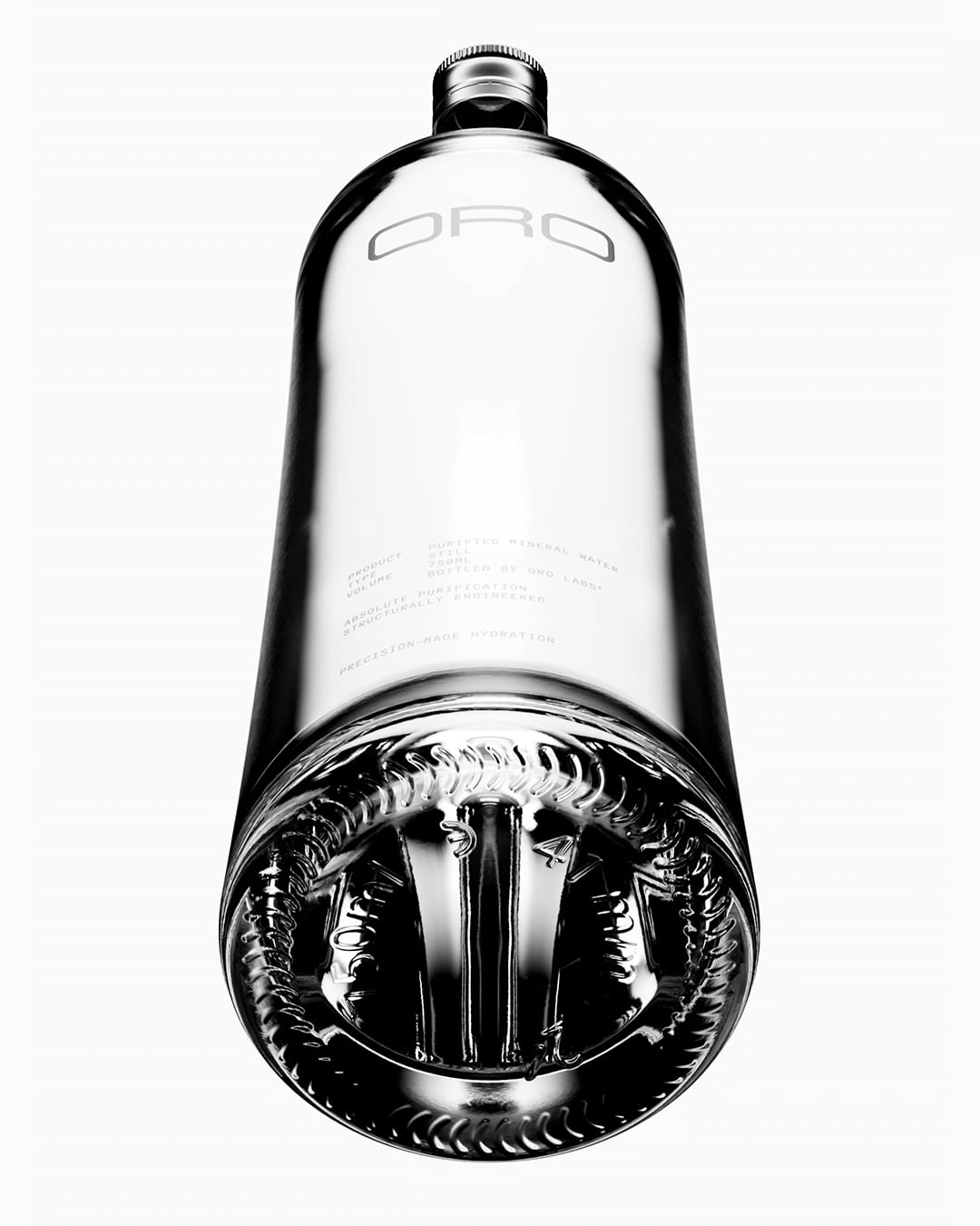
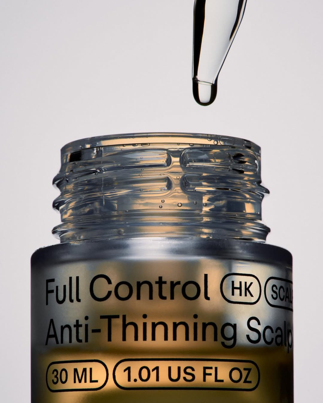
The genuine need state of the products permitted us to create a beautiful visual language and design system through its simplicity. We led with a singular typeface to define a typographic and product categorisation system that can scale across current and new product lines. Within this, enabling the brand to communicate a more emotive brand story.

Product Photography:

View Article
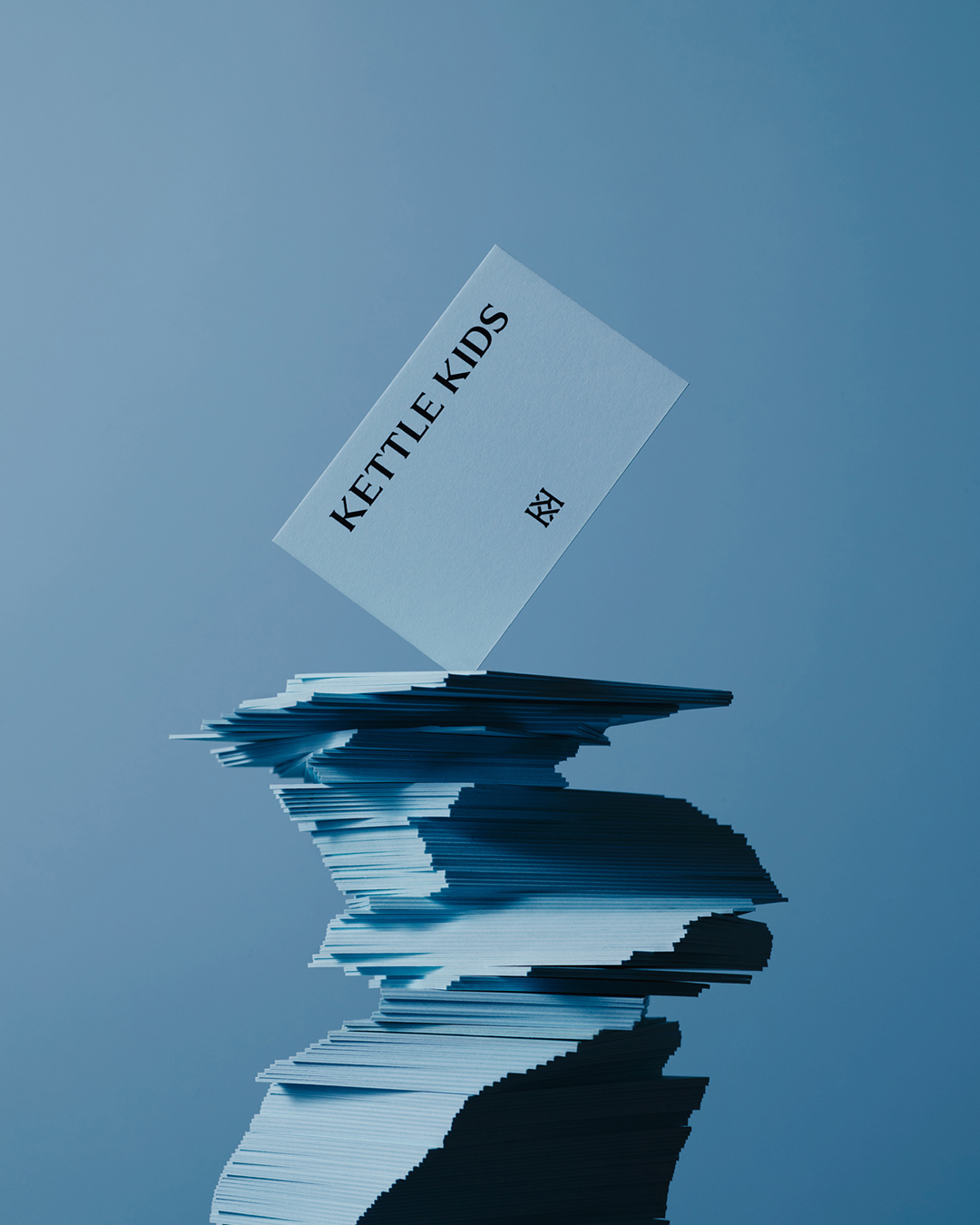
A retail identity elevating social influence into luxury commerce — Kettle Kids

Kettle Kids

A retail identity elevating social influence into luxury commerce

    Visual Identity
    Packaging
    Spatial Design

As a social first enterprise, The Kettle Kids initial success was driven through the mechanics of those platforms vs. the power of brand. With ambitions to compete outside the confines of social media, they wanted to create a brand that would compete with the leading luxury brands, many of which they were selling.

Their connection to London's rich visual culture served as our muse, inspiring us to draw from historic hand-crafted signage, architectural nuances, and material textures. This exploration led to the creation of a bespoke logotype, typeface, and monogram that beautifully blend the elegance of traditional typographic lettering with contemporary craftsmanship.

Our commitment to a cohesive brand experience extended the newly minted graphic language across spatial design including store signage, interior color scheme, and various printed materials, ensuring consistency and depth across all brand touchpoints. Furthermore, we developed a digital toolkit to amplify The Kettle Kids' presence beyond the physical space.

The Kettle Kids now operate several retail destinations in the UK with US and global expansions planned.

Product Photography:

Spatial Photographer:

Spatial Design:

View Article
Connecting water to life's every day moments — Our Taap

Our Taap

Connecting water to life's every day moments

    Art Direction
    Campaign
    Tone of Voice

We partnered with Our Taap to launch the campaign platform and brand voice for a machine that brings filtered, chilled, sparkling and hot water into the home. 

The product  sits in a category with a problem: nobody wakes up thinking about water. Hydration is sold like homework, in litres and reminders and science. The challenge was to make people care about the thing they drink without thinking, and to give a functional product an emotional place in the day.

Through our work with the brand we kept arriving at the same observation. Water is rarely the point of the moment, and it is present at every threshold of it. The tea before the meeting, the squash after the football, the chamomile on the evening walk, the bath at the end of it all. Every drink in the day starts in the same place. Our central campaign idea, More Water More You, celebrates water as the source of what keeps you going.

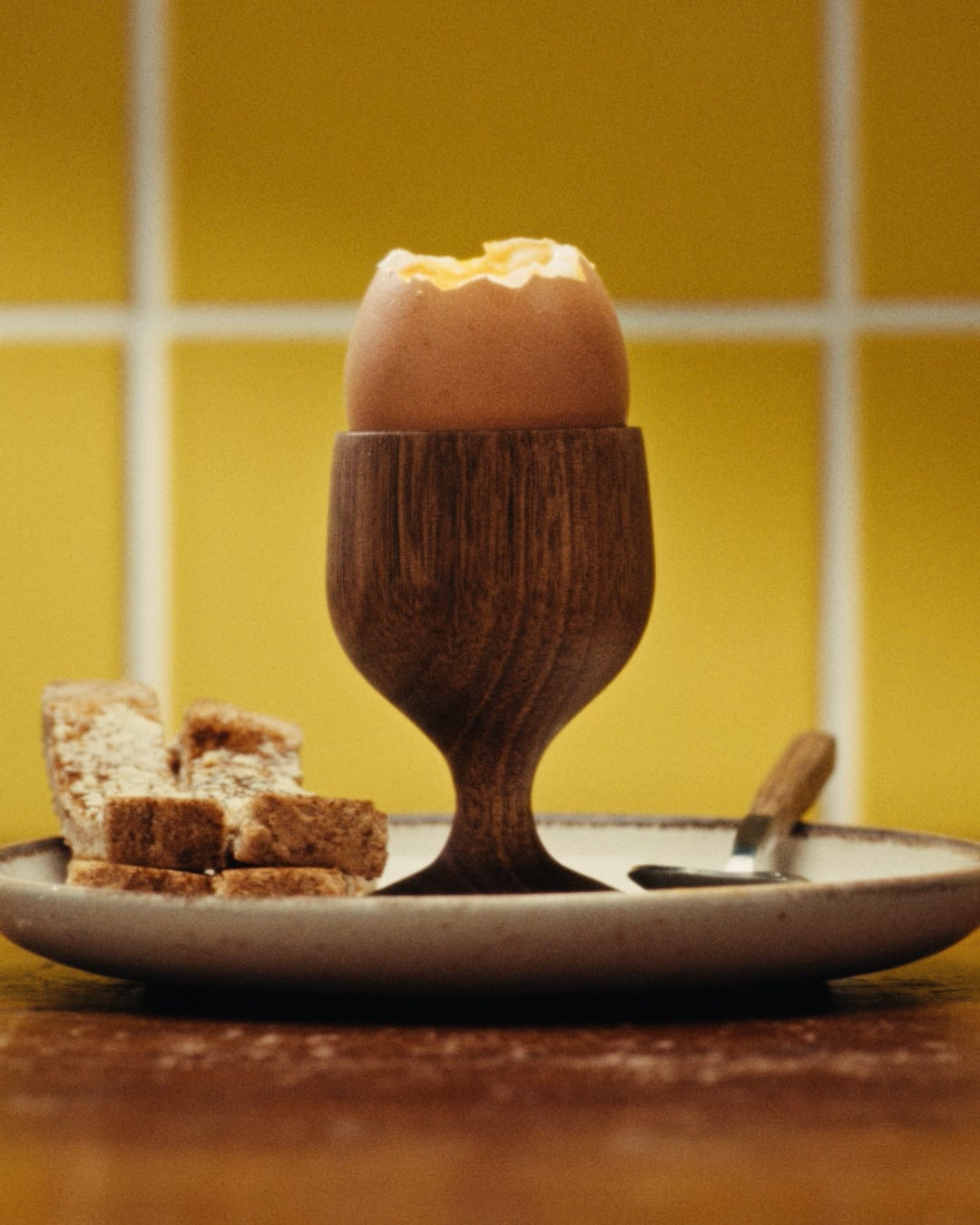
The hero film makes the idea literal. Running in split screen, it pairs each moment of a day with the vessel it fills: a boiled egg with the morning tea, a chess match with the cafetière, a sixth birthday with a party cup of cordial, grass-stained knees with a squash and a curly straw. A day of lives, carried by water.

Production:

Copy Director:

Tess O'Leary

Channel Strategist:

Mike Evans
View Article
Out of Place — Hello Klean

Hello Klean

Out of Place

    Art Direction
    Campaign

Production:

View Article
A rebrand to spearhead a move into retail — Kankan

Kankan

A rebrand to spearhead a move into retail

    Brand Strategy
    Visual Identity
    Verbal Identity

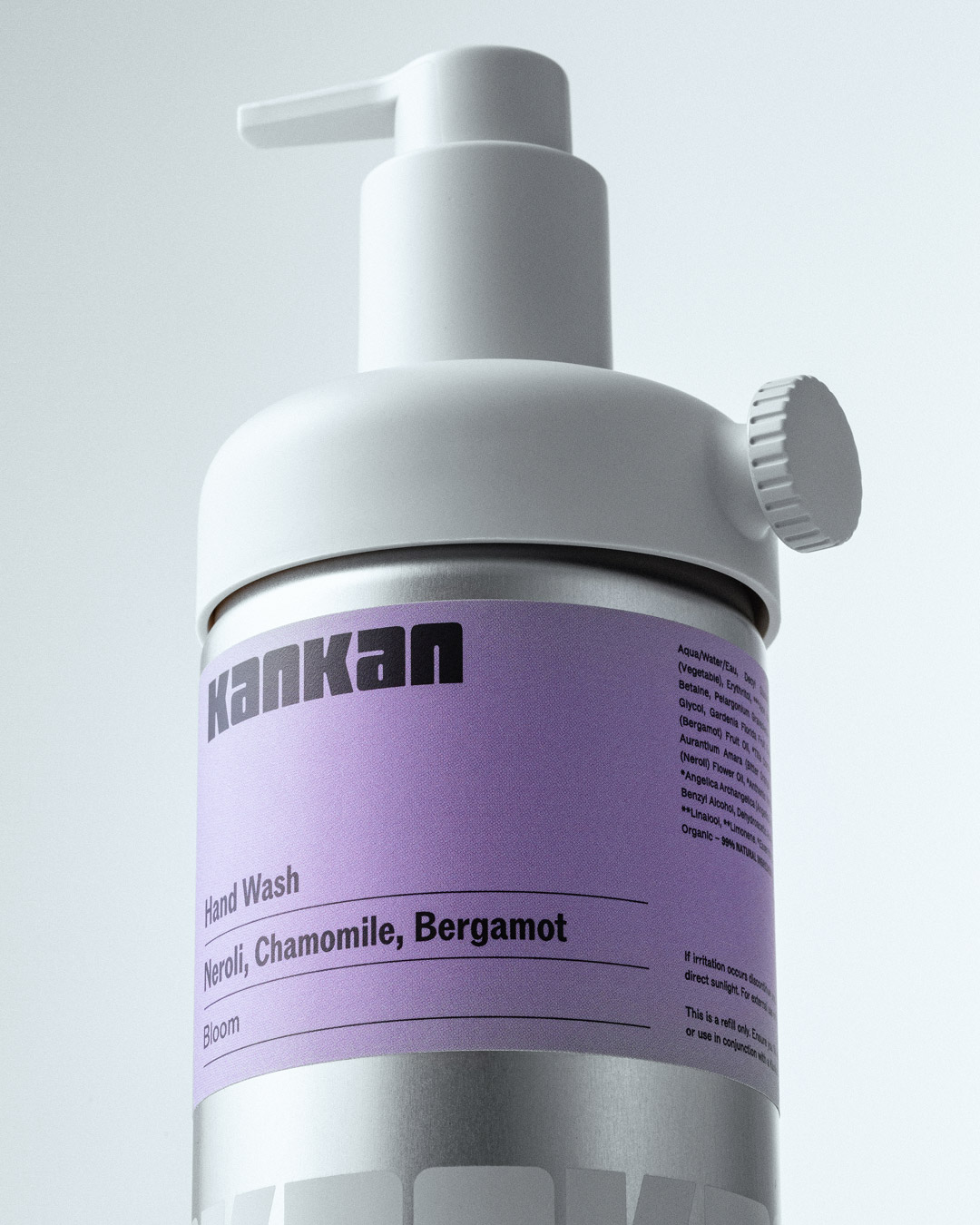
We partnered with the founders to relaunch Kankan as a personal care brand with a core focus on sustainability and circularity. Building on their goal of removing single use plastics from the bathroom.

With a focus on natural ingredients, we anchored our strategy in the Joy of connecting with nature. We took inspiration from the circularity of the natural world and how this cycle, if unbroken, offers us so much knowledge and wisdom. And we heightened the emotional benefits of ritualistic self care through the central brand idea; Feel More Joy Everyday.

Through the strategy of Joy, we developed an identity that had character, both visually and verbally. An interplay between a bold custom display typeface, vibrant colours and unique product design enabled a reimagining of the brand that cut a clear point of difference from the more subdued nature of many personal care brands.

The new identity gives KanKan a stronger presence within their existing d2c channels and, as importantly, provides a proposition to help unlock a drive into retail. Giving the brand the ability to communicate more clearly and directly to the consumer group seeking essential products with substance.

View Article
Two Times Elliott — Keats — two black KEATS dropper serum bottles side by side, The Hydrating Serum and Hyaluronic Acid, product pairing on a grey background

Keats

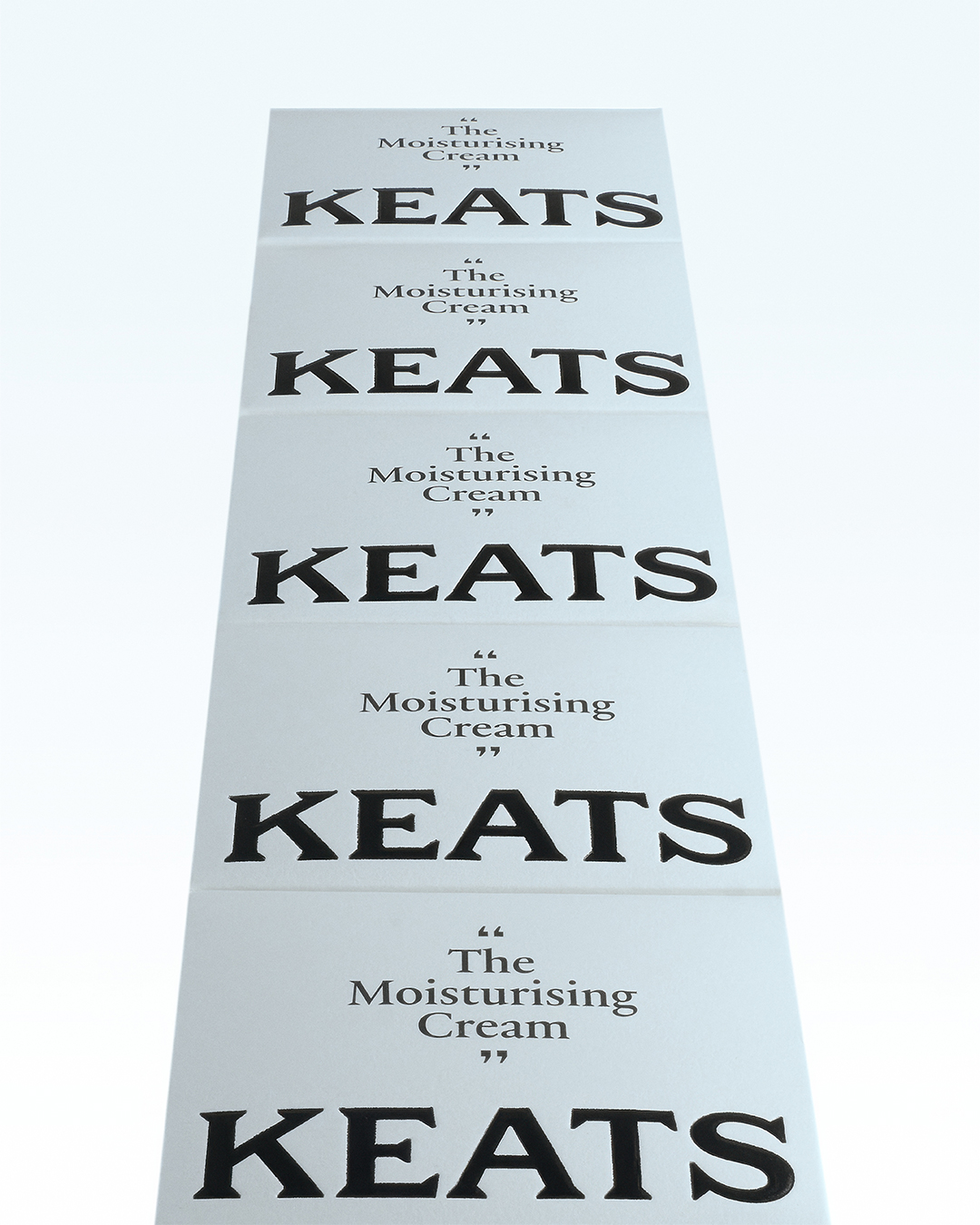
A brand designed to challenge the efficacy gap in luxury beauty

    Visual Identity
    Brand Strategy
    Production

Skincare is a crowded category with a transparency problem. Lucinda Hart, Keats' founder and a former product developer for some of the biggest names in beauty, knew exactly what was wrong with it — and built a brand to fix it. The proposition is straightforward and genuinely radical: luxury-grade formulations at accessible prices, with the efficacy percentages published openly so customers know exactly what they're buying. Few ingredients, proven ones.  with no filler.

We built the brand from scratch. Positioning, verbal identity, visual identity and full design system. The strategic territory sits at the intersection of British heritage and cultural disruption - borrowing the codes of luxury while refusing to behave like one. The creative tension between those two things is where Keats lives, and it's what makes the brand legible in a category that too often mistakes complexity for credibility.

The visual system was built to hold both sides of that tension. A typographic identity with genuine character. A design language precise enough to carry efficacy data and expressive enough to carry personality. Beauty is truth - not a tagline. The organising idea the whole thing runs through.

View Article
Space for the ambitious — UNION

UNION

Space for the ambitious

    Brand Strategy
    Visual Identity
    Website Design

The role of the office has been rewritten over the past 15 years – first through the rise of co-working, then by the disruption of the global pandemic. As the dust has settled on the shifts that occurred through both, a new model evolved that fuses the DNA of the co-working model together with the DNA of the traditional space leasing model – enter ‘Managed Office Services’. A model that not only benefits companies who are looking for dedicated space to grow, but is also now a core strategy for many landlords in this new work era.

We partnered with UNION, whose founders had been a key part in pioneering this new model within the UK, to reposition and rebrand them within a fledgling and incredibly clustered sector.

In a market still defining itself - and lacking the visible glamour of co-working - we needed to create status, cut through sameness, articulate the unseen value of the managed office model and signal the quality of the UNION’s progressive client base.

Our shift came in elevating service into an experience. At every touchpoint of UNION’s process was a dedication to creating a seamless transition for new clients - from securing, designing and managing a client’s space. And within this came the opportunity to reframe and own a more elevated category positioning ‘The managed office experience for today’s most influential companies’.

To accompany the more confident and category leading strategic direction, the resulting identity reflects the unseen systems and relationships that make UNION’s work effective. The graphic system brings a clarity of expression across the cornerstone of The Union Experience, tied together through a mark which represents a symbol of unification, built from a set of distinct shapes that come together as a whole.

View Article
A bold new brand for Europe’s largest Yoga movement — Hotpod Yoga

Hotpod Yoga

A bold new brand for Europe’s largest Yoga movement

    Brand Strategy
    Verbal Identity
    Visual Identity

We partnered with the largest yoga movement in Europe to help change the perception of who Yoga is for and what it can really do for people.

Having not updated the brand since launch, we needed to give their new brand idea - Find Your Hotpod Feeling - meaning and action. Over 3,500 HPY users told us why they take classes, their reasons enabled us to shift the perspective of Yoga from the generalised wellness badge, to one that spoke to specific needs and remedies.

A unique yoga experience that honours the traditional practice whilst evolving it, we were able to create a world which embodies the sensorial experience of a class, using that to create an opposing semiotic to the traditional visual language of Yoga. This was partnered by a brand voice that brought through a relatable reflection of what Yoga can do for you and your needs.

For the founders, one of their biggest struggles over their 12 year journey has been how to consistently execute the brand. Being a franchisee model has made this more complex. With them, we developed a Brand Action Framework which combined the attributes of the brand with the key reasons for why people practised, to develop a simple model that could help both HQ and franchisees generate ideas for campaigns, partnerships and ambassadors.

View Article
Reclamation told through ritual — Hello Klean

Hello Klean

Reclamation told through ritual

    Art Direction
    Campaign

Production:

View Article
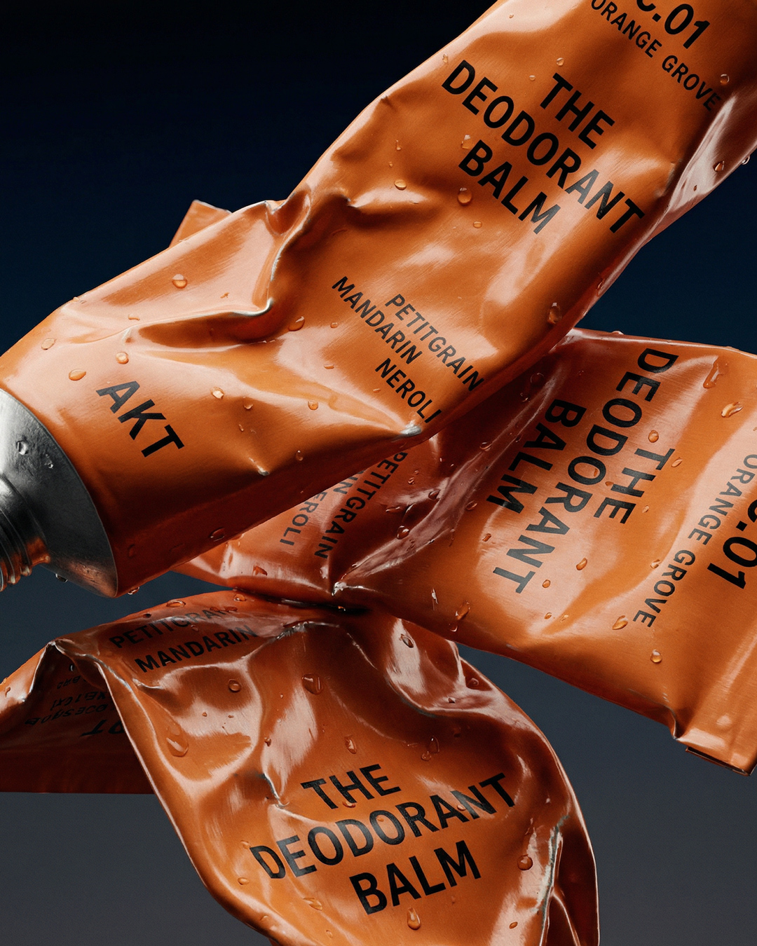
Reframing personal care as personal performance — AKT
Buy now

AKT

Reframing personal care as personal performance

Buy now
View Article
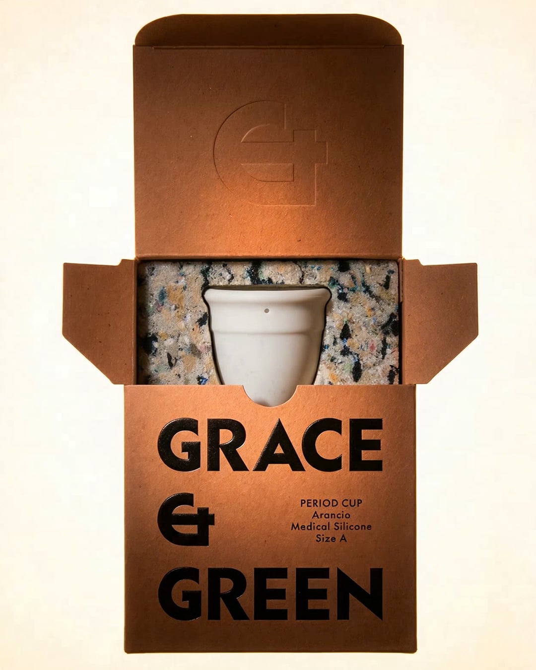
A bolder vision for conscious period care. — Grace and Green
Buy now

Grace and Green

A bolder vision for conscious period care.

Buy now
View Article
Building a brand to start new conversations on sexual wellness — ROAM

ROAM

Building a brand to start new conversations on sexual wellness

    Naming
    Brand Strategy
    Visual Identity

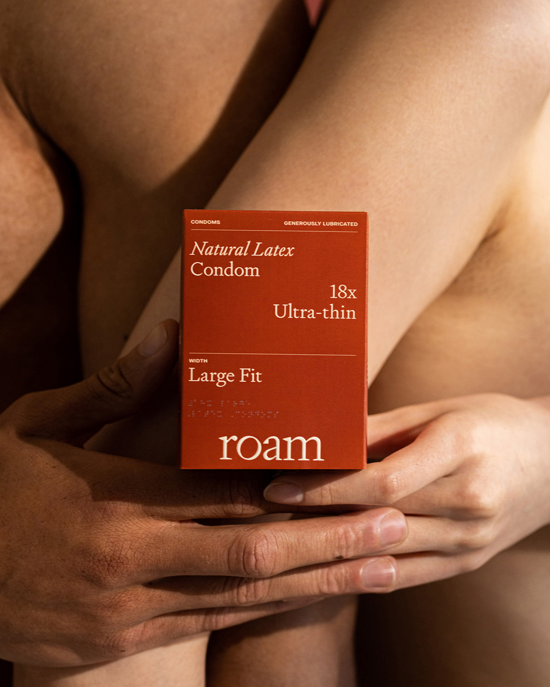
Our collaboration with Roam was born from a strategic research study revealing a significant market gap and unmet need for open and honest discussions about sexual health and well-being. The brand aims to empower individuals to embrace their fluidity and confidently explore their desires. By providing the necessary tools, questions, and language, Roam aims to create a space where people can articulate their boundaries and needs without shame or hesitation.

This brand identity was carefully crafted to embody the spirit of liberation and exploration that fuels Roam's mission; to encourage customers to embrace both self and shared love, sexual care and connection.

Our design and strategic approach have resulted in a brand identity that aligns with current conversations surrounding sexuality. It represents a crucial step forward in the world of sex care, advocating for a society where discussions about sexual health are normalised and seen as essential.

Product Photography:

Handover Agency
View Article
Two Times Elliott — Paist — two lilac PAIST Sensitive Mild Mint toothpaste tubes balanced cap-to-cap in a mirrored composition on a pale surface

Paist

Defining a new experience for oral care

    Visual Identity
    Packaging
    3D

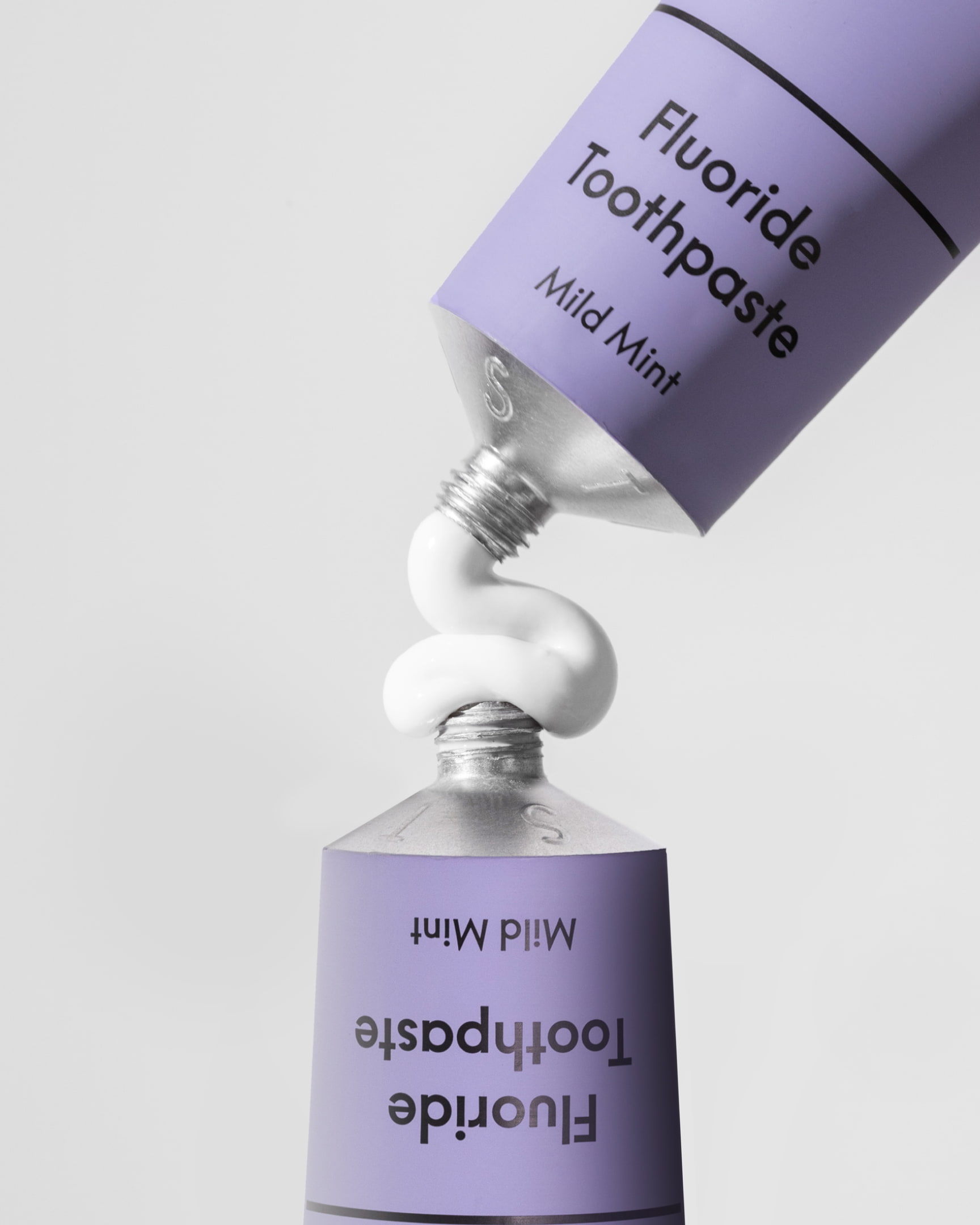
As a dentist, whose job was to recommend toothpastes, PAIST'S founder struggled with the fact that most are packed full of artificial ingredients, abrasive whitening options and almost all come in a plastic bottle - with over 300million tubes ending up in landfill in the uk every year. She wanted to challenge a legacy category of blue, white and red, with powerfully effective, natural, toothpaste that was 100% plastic free.

Our challenge was how do we make people care about sustainable toothpaste. Tapping into the mindset of a more conscious consumer, we focussed on clear, concise and transparent messaging and carried this simplicity into our design approach. Stripping everything back to present a vastly different sensibility to the existing category behaviours. We applied this new vision for the oral care experience across a full identity, packaging design and the platform experience.

PAIST is advocating for a shift towards a more mindful approach in our daily oral hygiene routine. A small but significant step towards building a more sustainable future.

Product Photography :

View Article
Making the invisible problem visible — Hello Klean
Watch the campaign

Hello Klean

Making the invisible problem visible

Watch the campaign
View Article
Life through fragrance — TESORO
View Project

TESORO

Life through fragrance

View Project
View Article
The Dysfunctional Object — The Art of Ping Pong + Mr Porter

The Art of Ping Pong + Mr Porter

The Dysfunctional Object

    Art Direction
    Film
    Product Design

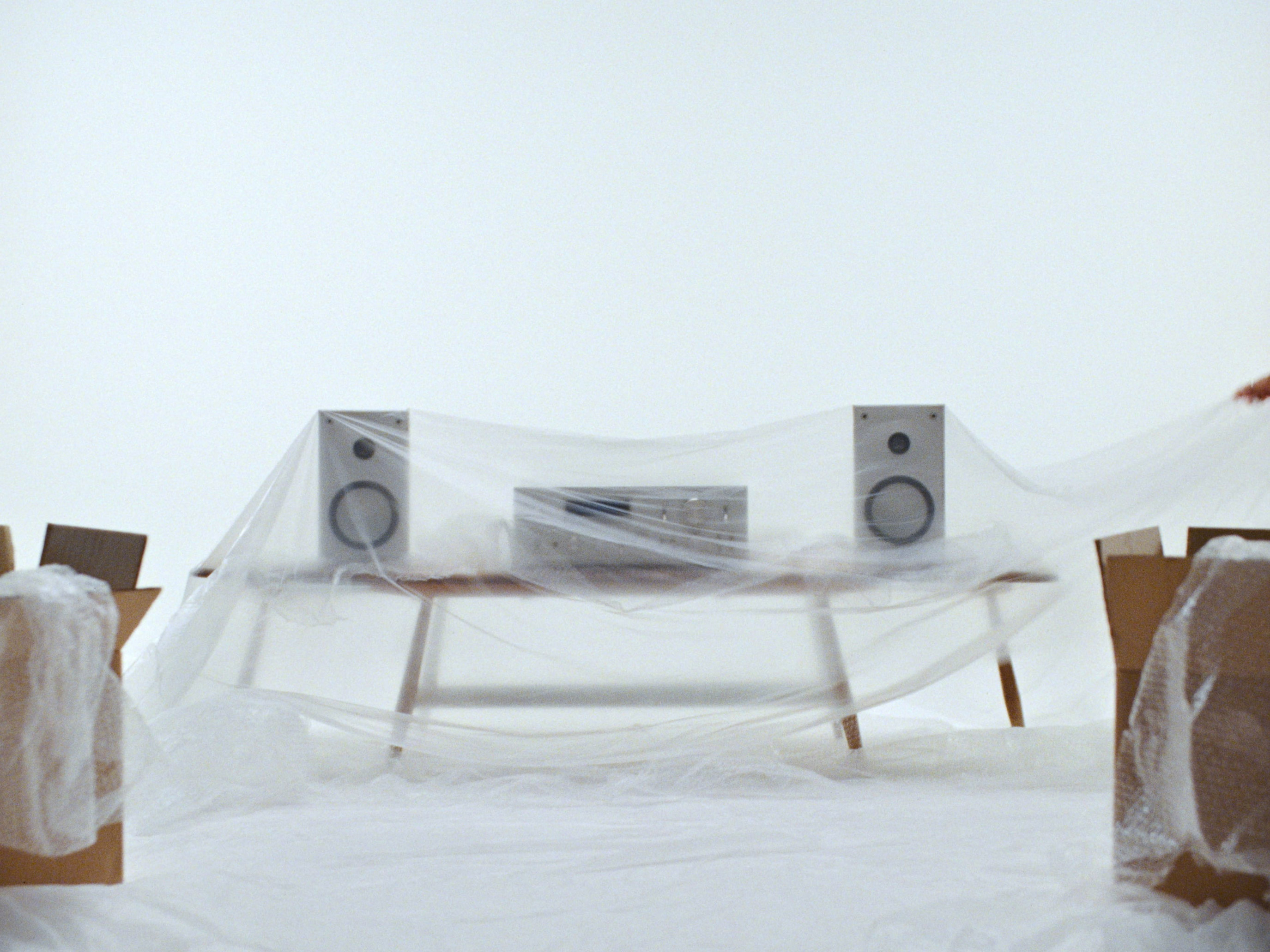
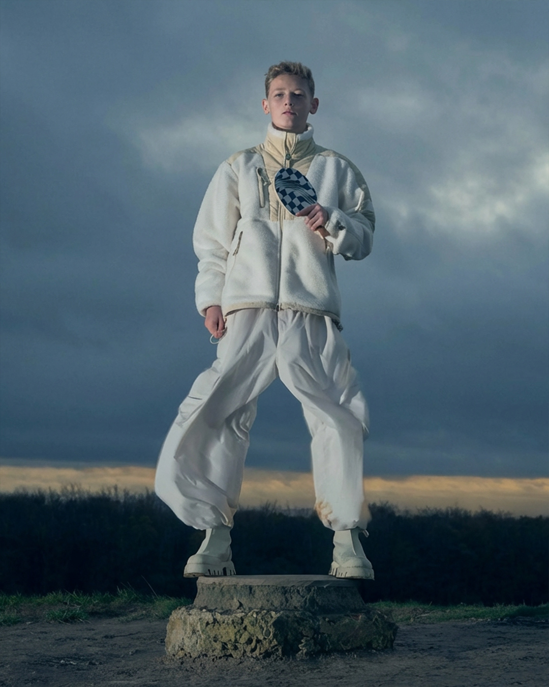
In the undulating landscape of Northumberlandia, two players engage in an otherworldly ping-pong match. This 60-second surrealist journey, set against Charles Jencks’s masterpiece, blurs the lines between time, reality, and illusion.

As the ball arcs through the air, it carries with it the weight of postmodern thought, challenging viewers to reconsider their perceptions of art and existence. The design for this ArtTable became a conduit for exploring the symbolism and surrealism inherent in Jencks’s philosophy and works.

Production:

Director / DoP:

View Article
The brand that transformed how we decorate — LICK

LICK

The brand that transformed how we decorate

    Visual Identity
    Brand Strategy
    Verbal Identity

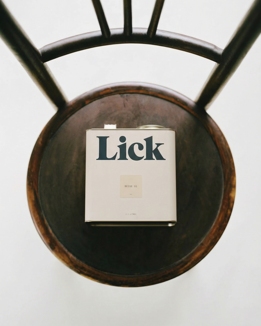
In early 2020, we partnered with Lick to create a brand that could unlock new value in a category that had not been challenged, even well into the d2c era.

The start point was a name and a paint can. Our challenge was to understand the mindset of the home decorator and to define a brand that could connect with them and speak to them in a way the current category couldn't.

What we found through extensive consumer research, was a massive opportunity to build a truly inclusive and educational brand, where the role of the brand was to be inspirer, partner and guide to the journey of the home decorator.

We matched the expressive with the functional - utilitarian labelling and product codes matched with a strong personality and voice. We thought through customer pain points and used them as opportunities to create a better brand experience. And we built a world where the customer felt empowered to be bolder and more confident in their interior choices.

The result? A brand experience that engages from the first interaction, showcasing Lick Home's ambition to redefine the world of home decorating while creating a welcoming environment for decorators of all backgrounds, from beginners to experts.

View Article
Demystifying the art of gift giving — The Go To
Visit Site

The Go To

Demystifying the art of gift giving

Visit Site
View Article
A brand to challenge the status quo of wellness — OTHERS

OTHERS

A brand to challenge the status quo of wellness

    Visual Identity
    Brand Strategy
    Film and Photography

The founders of Others believed in a simple hypothesis, the wellness industry was broken. Through a two year collaboration we helped build a brand that proposed an alternative narrative to the mainstream.

Our vision for the brand was to enable humans to thrive in a tech saturated world. Creating tools to empower us to feel more in control, emotionally resilient and better equipped to navigate the global chaos and loss of meaning. Approaching this new vision through a subcultural lens which focussed on community and a holistic offering. Platform first, product second.

As we approached design, we wanted to create a juxtaposition between nature and technology to embody something that was sensorial and welcoming but quite counter the current visual semiotics of the wellness sector.

Taking this anti-establishment mentality further, the logo we designed for ØTHERS we leaned into the concept of "mind hacking" through the dynamic sorting motif. This theme of neurological enhancement is further explored through an immersive digital experience and the integration of Art Company Mono font with an organic coding system.

As the brand enters the market, it shines as a pioneer, advocating for a more comprehensive approach to personal health.

Product Photography:

Videography:

News

An early preview

Work

Early mark explorations for a project launching later this year.

View on Instagram

Talking Thursdays - Episode 53 with Mark Jones

Talking Thursdays

This week on Talking Thursdays, we were joined by our good friend, Mark Jones, Creative Director of London based, Studio Blackburn. Episode 53, now live.

Watch The Episode

Our Taap - More Water More You

Work

Our project with Our Taap is now live. We partnered with the brand to create the campaign platform and verbal identity for a machine that brings filtered, chilled, sparkling and hot water into the home. Built around the idea of water as the source of what keeps you going, the campaign pairs each moment of the day with the drink it becomes, from the morning tea through to the evening bath. The hero film and cutdowns are running now across the full funnel.

Hello Klean @ LN-CC

Work

Looking back on last night with @helloklean at @thelncc as we approach the launch of their new campaign - coming next week! 

View Images

Hello Klean receives an investment by Brita

Work

Our client and long-term collaborator Hello Klean has secured a strategic investment from Brita, the global water filtration brand. A significant validation of Hello Klean's positioning at the intersection of water quality and personal care and a signal of where the category is heading. Read more about the partnership over at Business of Fashion.

Read more

AKT London launches into Sephora

Work

A major retail milestone for our client AKT London - the Deodorant Balm rolls out into 288 Sephora US doors on 6 April, with a full assortment live on Sephora.com from 17 March. The brand's largest retail partnership to date, and a significant moment for UK body care breaking into the US market. Read more over at Business of Fashion.

Read more

Talking Thursdays Episode 52 w. Mònica Losada

Talking Thursdays

Talking Thursdays is officially back after a short hiatus. This week we are joined by the amazing Mònica Losada. The episode premieres this Thursday (14th) at 9am via our YouTube channel. 

Watch the episode

Looking for Senior Freelancers

Studio

We’re looking for senior freelancers to support on a number of upcoming projects. Brand designers, digital designers, copywriters and cultural researchers with a strong focus on CPG across beauty, wellness, self care and lifestyle. London based is preferred, but not necessary. To apply please send your portfolio to [email protected].

James Horwitz to speak at Huiput Festival

Studio

Founder, James Horwitz will be speaking this May at Huiput Festival. His talk, Creating Space, reflects on what it means to slow down, sit with uncertainty, and give yourself room to grow without rushing to define everything too early. Drawing from his own experience building the studio, James will speak openly about vulnerability, recalibration, and the quieter decisions that shape a creative path over time.

Buy tickets

Hello Klean launches Scalp Serum

Studio

To announce the launch of Hello Kleans latest product, the scalp serum, we collaborated with Will Clark and Jamon Jamon for the brands latest campaign, 72 Hours. The product lands this Wednesday, 21st January.

Buy now

Founder, James Horwitz speaks with podcast, NDA

Feature

Our founder James was invited to speak with the team at NDA about burnout and the navigating it as a founder. The episode is now live on Apple Podcasts and Spotify.

Listen now

Kettle Kids open in Bond Street

Work

Congratulations to our clients, the Kettle Kids on their new flagship store situated at 38 Bond Street

VIEW POST

The physical studio is waning

Features

Founder, James Horwitz speaks with ItsNiceThat about the importance of space, its role in providing inspiration and the intentionality of coming together with purpose.

Read Article

Edmund and James to speak at POV Budapest in September

Studio

Founder, James Horwitz and Creative Director, Edmund Lock will be speaking on the mainstage at this years POV festival in Budapest. Tickets are available now. 

Buy Tickets

Talking Thursdays Episode 51 w. Morgan Light

Talking Thursdays

Tickets now available for Episode 51 of Talking Thursdays with New York based designer Morgan Light

Get your ticket

Edmund and James to speak at Typocircle

Studio

Design Director Edmund Lock and Founder James Horwitz will be speaking at Typocircle later this month. Tickets now available. 28th November, 6pm. 

Buy Tickets

Talking Thursdays Episode 44 w. Marcos Rodrigues

Talking Thursdays

In this episode of Talking Thursdays, Brazilian designer Marcos Rodrigues joined us from beautiful Lisbon. Marcos discussed his childhood and early influences growing up in San Paulo, exploring how his work sits between iconic and utilitarian and his perspective on the importance of interactive design in branding.

Watch Episode

Stuff has arrived

Studio

"Stuff" is an ever-growing collection of objects, printed material, and apparel, where our XX logo becomes the vehicle for self-expression and continued experimentation. Each collection, free from predetermined release dates or specified formats, explores a forever transient medium to express our variable identity, reflecting our people and our practice.

View Store

Talking Thursdays Episode 41 w. David Broner

Talking Thursdays

This week's episode of Talking Thursdays with talented David Broner is now live on our YouTube channel. The France-born designer takes us through his childhood obsession with architecture, his connection to his grandfather's work within animation and the journey of building his own experimental practice.

Watch Episode

D&AD Festival 2024

Work

D&AD approached us earlier this year to craft the central idea and visual identity for this year's Festival and Awards. Focusing our narrative on the overwhelming amount of visual stimuli surrounding us everyday, we created a motion-based system that visually reflected this. A system starting in the overwhelm but transitioning through to points of focus and clarity.

Talking Thursdays Episode 38 w. Art&Graft

Talking Thursdays

In this episode of Talking Thursdays, we were joined by Art&Graft. The London-based creative agency discussed the importance of studio culture and how this became integral to their recent rebrand with design studio Regular Practice.

In addition, Art&Graft showcases its strategic, collaborative, and experimental approach to the creative process through a range of incredibly diverse commercial and self-initiated projects.

Watch the Episode

Kinland - Craft-led spaces

Work

A favourite from early 2023, brand identity, direction and website for London based developers, Kinland.  A big thanks to Simon Rogers for the website development.

View Website

BP&O: A calming riposte to chaos

Feature

BP and O covered our identity for challenger toothpaste brand, Paist. "It takes confidence and skill to create an identity that shuns pretty much all of the conventions of a category; and Two Times Elliott has achieved that superbly, borrowing from the language of Instagrammable D2C but without learning too far into the whole millennial minimalism thing."

View Article

When Forms Come Alive

Studio

Friday inspirations, courtesy of the Hayward Gallery and "When Forms Come Alive". A celebration of 60+ years of contemporary sculpture. On now until May 6th, 2024.

View Images

For those who value tomorrow

Work

We recently partnered with independant family office, Hundle, to rename and reposition as well as create a brand identity to reflect their aspirations to lead the charge on shaping future of wealth management.

View Website

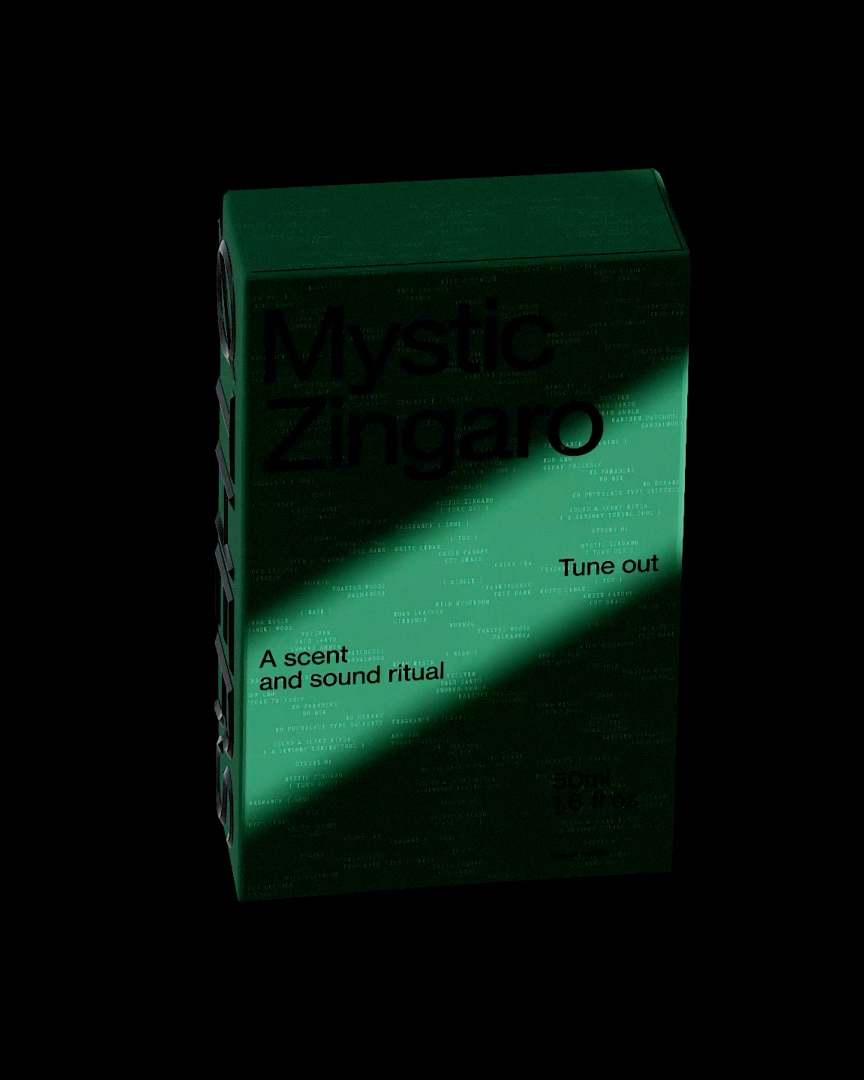
Two Times Elliott creates an “orderly yet unpredictable” identity for experience-led fragrance, Øthers

Feature

For the new “scent and sound ritual” the studio has conjured up an identity system that aims to mirror the experience of the product itself.

View Article

Brand strategy, rebrand and website for ethical estate agency, Brickworks

Work

Brickworks approached us to create their strategy and brand identity.  Brickworks is committed to forging a new path for the industry and giving back along the way. 

View Website

BP&O discuss our visual identity and spatial project for The Kettle Kids

Feature

Two Times Elliott describes its approach to the identity as ‘taking cues from…material palettes’, which makes sense as a way of conjuring the tactile luxury of the fine objects handled and sold by the brand.

View Article

Kingsland Road, Hoxton

Studio

We are really excited to have moved into our new studio space in Hoxton, East London.

Identity and Website for Industrial design practice, Blond

Work

Our long-term collaborator, Blond, approached us to rebrand their studio as well as their new website. 

View Website

Talking Thursdays, Episode 33 w. Jo Roca

Talking Thursdays

In this episode of Talking Thursdays, we are joined by the Former ECD of Sydney-based design studio For The People, Jo Roca. The Columbia-born designer talks us through her work within "Place Branding", and the extremely personal processes of creating brands that encapsulate communities and geography.

Watch now

The Art of Ping Pong x Mr Porter

Collaborations

One of our main inspirations for this project is the renowned architect Charles Jencks. The idea was to capture the table in its natural environment, paying homage to the concepts of playfulness and illusion, all central to Jencks' postmodernist design philosophy. 

View Table

Cassie Ciccarelli joins XX as a Midweight Designer

Studio

We welcome Cassie to XX as a Midweight Designer. With a bachelor of Design in Visual Communication from the University of Technology Sydney, Cassie is fascinated by how culture and current affairs influence brand perception.

The Dieline covers our visual identity for Paist

Feature

The Dieline discuss our visual identity for Paist and how it stands out by ignoring the conventions of category codes.

Read Article

Inclusive Access 23

Events

We're stepping into another week of exciting work at XX, and this time, it's with the incredible support of Nike and Footpatrol. Our ongoing commitment through our initiative, Open Book, highlighting and celebrating individuals with disabilities, is taking a significant stride forward. Following the immense success of ia22, we are back with our next live event. Details available now via our Instagram.
http://www.instagram.com/twotimeselliott

Sarah Lucas, Happy Gas

Visits

Yesterday, we headed to Tate Britain to view the self-narrated works of celebrated artist, Sarah Lucas. Best known for her provocative interpretations, the work was a journey of unexpected objects, humour and sexuality but most of all an underlying profoundness, brashness and ultimately, abundant humanness. Happy Gas is running at Tate Britain until January 14th 2024.
Book Tickets

In Use - Anything but ordinary

Work

Essentials company, In Use, exist to build intention into the anatomy of everyday things. The Korean brand approached us to create their brand naming, strategy and brand identity.  

View Article

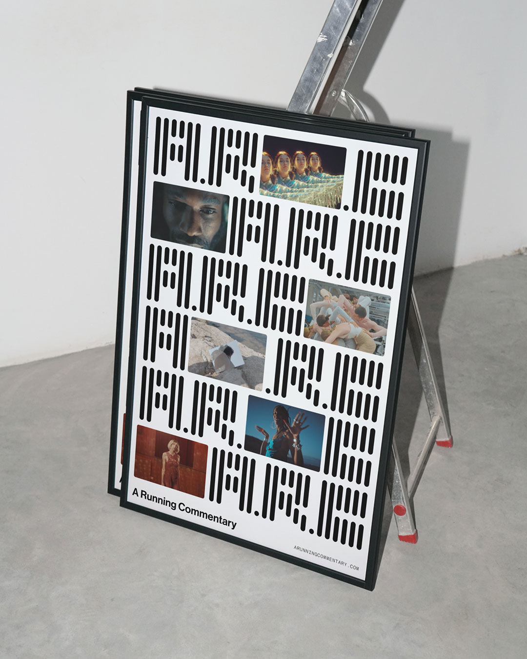
Its Nice That cover our re-brand for A Running Commentary

Feature

Two Times Elliott’s latest rebrand is inspired by “nuts and bolts” of filmmaking.

Read Article

Others launches at Frameless

Client Launch —6.9.23

In connection with the debut of the perfume brand, Others, we participated in a group breathwork and meditation event held at Frameless. The venue featured ceiling-to-floor screens showcasing a sequence of visuals that served as our guide throughout the mindful experience.
View Article

XX + Two Pages - The re-imagination of the One Pound Coin

Collaborations

We were recently asked to contribute towards Two Pages, a collection of sketchbooks that connects the creative community. The theme of the latest sketchbook was to create a visual response inspired by the One Pound Coin.
VIEW PROJECT

XX explain Charmed, the conceptual project fuelled by experience and expression

Features

In recent times our society has experienced a succession of profound shifts. The turmoil felt by many throughout the pandemic, Continued political instabilities, Russia’s invasion of Ukraine, and the inequity brought on by unnerving economic inflation – are all collective emotional realities that we seek to address through creativity.
https://the-brandidentity.com/insight/two-times-elliott-explain-charmed-conceptual-project-fuelled-experience-expression